
It’s inevitable: any article that mentions increases in renewable energy capacity, be it wind or solar, will be met with a smart-aleck comment that renewables don’t operate at capacity and therefore are inferior.
Of course, the fact that renewables are variable producers is taken into account when assessing their value, and, it should be noted, even fossil-fuel plants don’t operate at 100 percent capacity on an annual basis. Still, installed capacity, while important, is of limited value and in the end, it’s generation that counts (along with when the power is generated, but that’s another story).
So, courtesy of the National Renewable Energy Lab’s Renewable Energy Data Book (PDF), here are some charts that show the progress of solar and wind capacity and generation in the United States. First, wind:
Source: National Renewable Energy Lab's 2012 Renewable Energy Data Book
To put the 2012 total generation (140,089 gigawatt-hours) into perspective, that’s 3.4 percent of all the electricity generated in the United States in the year. Doesn’t sound like that much, but a decade ago, it was barely a few tenths of 1 percent.
Now solar:
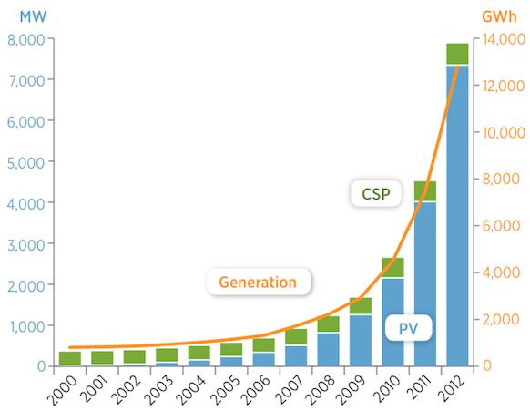
Source: National Renewable Energy Lab's 2012 Renewable Energy Data Book
The 12,775 gigawatt-hours of solar pumped out in 2012 made up just 0.3 percent of total electrical generation in the year. But here’s the hopeful thing: it was also 74.3 percent more solar generation than in 2011. And with the price of solar becoming more competitive, there’s every reason to think that high growth rates can be sustained.
***
Editor's note: This article is reposted in its original form from EarthTechling. Author credit goes to Pete Danko.


 41
41
 15
15
 9
9