
Through a combination of energy disclosure laws and new applications for IT in buildings, we're seeing a lot of interesting data emerge about our built environment.
Turns out that in Seattle, police stations are energy guzzlers. In New York, buildings built in the 1930s are more efficient than newer, certifiably "green" ones.
Last year, FirstFuel reported that more than half of efficiency opportunities in commercial buildings are actually no- or low-touch improvements. Retroficiency also showed that traditional measurement tools aren't really targeting the buildings with the highest potential for savings. And in the residential sector, Opower illustrated how electricity use drops during events like the Super Bowl.
But WegoWise, another IT firm tracking energy use in buildings, may be the winner for the most creative way to present the data it's digging up. The company just launched a new website called Visualizing Building Efficiency that, well, helps you visualize building efficiency. Here are a few neat samples.
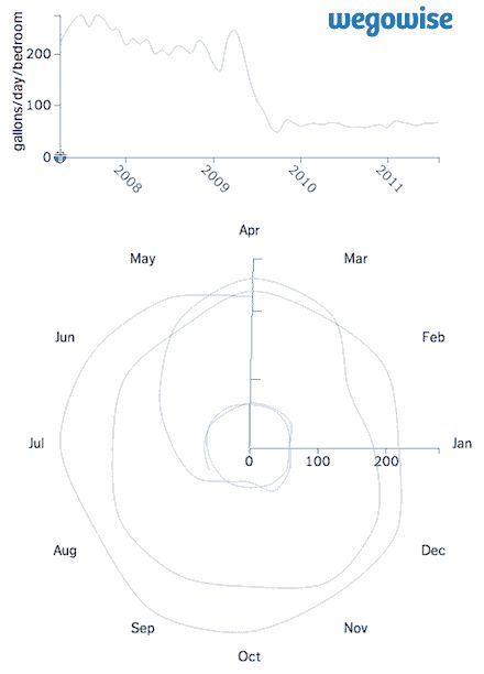
1. Savings from a toilet retrofit look like a toilet flushing
The top area illustrates savings from a multifamily building that installed low-flow toilets in 2009. The bottom portion uses polar coordinates to make those savings look like water swirling down the toilet.
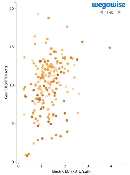
2. Building energy use intensity looks like a flock of birds
This graph was created using monthly billing data tracked by WegoWise. As the months are cycled, you can see how natural gas use peaks in the winter and electricity use peaks in the summer. The color variations are simply used to show individual buildings.
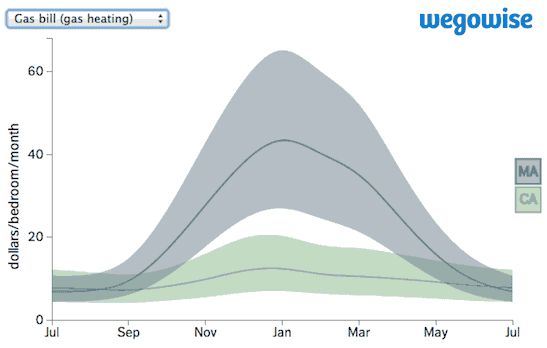
3. Regional energy consumption differences look like a rubber band
We talked about the data below in an earlier story. This graph compares differences in natural gas and electricity use within multifamily buildings on the East and West Coasts.
During winter in Massachusetts, buildings with the top 25 percent best energy performance pay $25 per bedroom for gas heating, and the lowest 25 percent of buildings pay $65 per bedroom. The disparity between high-performing and low-performing buildings isn't as big during California summers, but the graph shows a similar trend.
You can find a couple more of these plots from WegoWise here. With billions of data points being crunched every day in commercial and residential buildings, we can likely expect more visual insights on the way.


 41
41
 15
15
 9
9