Here's a chart spotted by investor Sunil Paul of Spring Ventures and found in the Washington Post document cloud. It's a data-rich slide with solar panel price estimates from market analysts at a variety of investment banks, including UBS, Barclays, and Deutsche Bank, versus the actual price of crystalline silicon solar modules from China.
I've studied this thing and here are the conclusions I can garner:
- Crystalline silicon module prices from Chinese vendors have really dropped.
- Predicting the future is hard.
- As per Vinod Khosla, most analyst predictions are as accurate as dart-throwing monkeys. In all fairness, the analysts here saw the downward trend and slope of the price drop, just not the sheer magnitude of the plunge.
None of these bullet points are exactly revelatory to those in the solar industry. But this is still a good graphic representation of the solar price drop. Of course, the trade claim posed by Solar World in recent weeks is that at a certain price threshold, this constitutes an example of dumping.
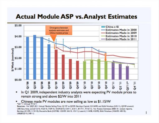
By the way, that quote -- "It is difficult to make predictions, especially about the future" -- and its many variations has been attributed to everyone from Mark Twain to Yogi Berra to Niels Bohr.


 41
41
 15
15
 9
9